Symbols
|
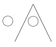
It is recommendable to relate symbols to one another when they express related categories. For example, a black filled symbol relates to a circle with a centered dot which relates to just the circle. You may either create families of symbols beforehand or by have symbols created on the fly out of a set of constructing elements with each element representing a category (with absence of the element form the symbol denoting absence of the appropriate category).
Symbols as applied in the Morfologische Atlas van Nederlandse Dialecten make use of the following features (in order of relevance):
Shadow should be even less considered for the same reason. A coloring of the base map shouldn't be used in symbol maps since a symbol map seeks to avoid indicating any measure of areal extension of the information at any symbol point. A colored border of a symbol might work when only a few colors are being applied. Yet the force of expression of the main symbol is diminished by having colored borders and should therefore not be considered as well. The application called Kloeketabel exporting HTML-maps uses the following features:
Gradation in tilting as well as shadow have been left out as options within this application. As mentioned before, this kind of variance of symbols is more appropriate for content-rich maps which are meant to be studied carefully instead of conveying immediate messages. Maps (within the Kloeketabel- and website-application) presenting intensity use symbolic differences rather than differences in size of the same symbol. Gradational differences or better the five category scales are now expressed by a growing 'darkening' of the symbol. Five scales of intensity or frequency differences is a maximum; more than five scales will not be noticed in one view. Differences in size between symbols are hard to distinguish especially when adjoining sizes are wide apart on the map. Symbols of a larger size may also overlap or even cover smaller ones. These intensity maps, finally, apply one color difference in order to enhace the expression of the map. Divisions become clearer at the first glance. It might seem, though, as if two categories are being presented in stead of gradations within one catgeory. Actually this is the case: the five categories of differences in scale are divided into two main categories which attract attention first. Fine tuning of the five scales used may adapt your map towards a better fit with the intended message. Black & white intensity maps of course have no extra color dimension added on top. Now an example of the influence of neighbouring elements on the impression of the eye concerning the difference in symbol size. Even the lines of the base map and their resulting areas of white space may suggest a difference in size which really does not exist. Therefore, once again, the option of difference in size for expressing gradation has been left out of the current applications.
Note: Because the 'Kloeketabel' generates HTML-maps it is very well possible to design and use one's own symbols. Mind to use the same names as the original ones. Finally, for each map one should pause to consider the meaning intended to be conveyed. This is of importance for choosing the right categorization of your material and for the right choice of symbols. One should know beforehand the data (or the length of the locality lists) which are being mapped in order to choose the most expressive symbol for the category in most need of expression. And one should have a picture of the relatedness of the mapped data in order to choose appropriate relations among the symbols. The colored symbols are meant to contrast sufficiently. The logic of the mixed colors shoukd be immediately obvious (red+yellow=orange, blue+yellow=green, blue+red=purple, all=black); adaptation for color blindedness meant giving up on this logic. When you should wish to present maps interpretable by colorblinded colleagues you may either use black & white symbols or upload a screen-image of your map at http://www.vischeck.com/ to have it daltonized (for maximum contrast when colorblind). LinksTaking one's time to ponder on cartographic principles will eventually lead everyone in the same direction. Yet as one of the first and at the same time one of the most extensive studies into graphic (re)presentation is generally regarded the widely acclaimed Sémiologie graphique of Jacques Bertin (1967, Paris: Mouton; a rare English translation should exist).More on Jacques Bertin at the site of the proponent of the use of images, Planque. Or experience an abstract of Sémiologie graphique at the site of the renowned Institut d'Etudes Politiques (Sciences Po) at Paris. A French course on cartography is to be found at the University of Geneva. Comparable courses at kartografie.nl. A (dutch) abstract of a dissertation (in english) (1992) on symboolontwerp can be read at the University of Utrecht. A (german) dissertation (1998) on geographic visualisation can be foudn at the University of Darmstadt. Reports (in english) on psychological research with respect to maps and symbols can be traced at the site of researcher and designer Phillips.
Read more on visual presentations in general at the site of Edward Tufte.
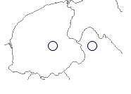
ImpactA nice example of the impact of cartographic symbols is the origin of the technical terms used in Dutch grammar to denote the different orderings of words in subclauses. The difference hinges on the place of the auxilliary. The next sentence is said to have the 'red' ordering:'dat hij is gekomen'. The order of words in the following sentence is termed 'green': 'dat hij gekomen is'. These colors stem frothe red and green circles used on a dialect map of A. Pauwels from 1953 (De plaats van het hulpwerkwoord, verleden deelwoord en infinitief in de Nederlandse bijzin, Leuven). |